- news
- BIG DATA. How to (well) represent relationships between data ?
BIG DATA. How to (well) represent relationships between data ?
GRAPHICS. A literal translation of” big data”, the expression” big data ” seems incongruous in French. And beyond their fabulous technological promises, they still pose a number of conceptual problems… starting with their visualization. “The key question is what is the most relevant visual metaphor to show something,” explains David Auber, Senior Lecturer at the University of Bordeaux 1, and specialist in data visualization, on the occasion of the Innovation Big Data day organized by the CNRS. “The brain processes the image 60,000 times faster than the text,” outbid Josselin Perrus, product director of Linkurious (an online tool used by journalists behind the decryption of the Panama Papers to visualize the connections between the various personalities involved in the case). The whole problem then lies in the level of simplification or detail to adopt, big data can – by definition-involve huge amounts of data with equally plethoric interrelationships.
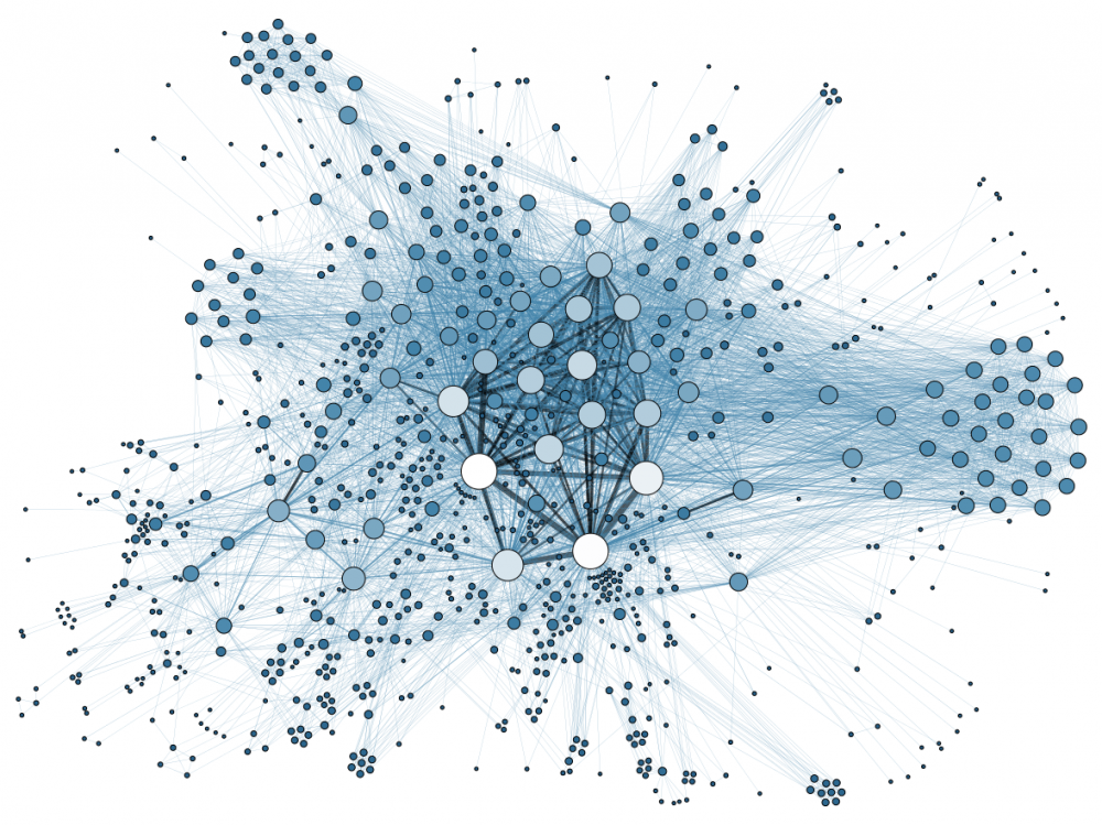
Graph describing the relationships between the Panama Papers files for one of the protagonist cited in the folder
But what is a “graph”? It’s a good bet that you’ve actually seen it before, like the example below. Derived from a mathematical concept, this type of visualization makes it possible to unravel a complex network of relationships in order to make it intelligible, for human beings as for machines. When it comes to visualizing a network of relationships between a large group of entities, ” the graph remains one of the most effective ways because it shows a visual connection,” emphasizes the researcher. Facebook has not for nothing called its API (ie its set of functions open to developers outside Facebook to develop their own services)” Graph “because it allows access to the network of relationships between Internet users and “liked” pages in the form of graphs.
“A visualization mode used to fight the apology of terrorism”
The point is not only to simplify the visual representation in order to provide a more intuitive working base for experts. It is also a question of facilitating mathematical treatments. “By processing the data in the form of a graph, we go from a multi-dimensional model to a relational model, which is easier to understand to make calculations : everything then boils down to a path calculation,” continues the datavisualization specialist. It is by applying this type of mathematics that Google’s neural network, DeepMind, was able to learn to orient itself on the map of the London underground (this type of map is a typical example of a network graph). And how do graphs facilitate the work of experts ? “It’s still more visual than a matrix,” smiles David Auber. Antoine Lambert, software engineer at Thales and collaborator of the researcher, explains some of the concrete applications of graphs : “it is an approach widely used in intelligence to search, from the logs of telephone calls communicated by operators, the communities of suspicious actors often interacting with each other in the context of the fight against the apology of terrorism”. Textual analysis of tweets also makes it possible to cross-check groups with suspicious behavior. “It can also be used in cybersecurity to visualize machines that emit a suspicious data stream and have probably been infected.”
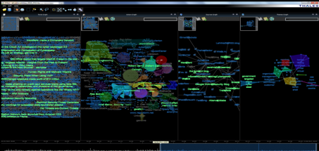
Screenshot of Thales ‘ Osint Lab platform, which helps fight terrorism advocacy
A format poorly adapted to 3D … but who can cross the walls
Unfortunately, this format is not a silver bullet : it always raises the question of scaling when there is a lot of data to visualize. “There are two possible approaches”, illustrates Antoine Lambert. “Either we zoom in, or we abstract the data according to different levels of detail. There is a human choice to be made.” Another problem lies in the lack of orientation of the different objects of a graph, which also has to be the subject of a reasoned choice.”The problem is that there is no position in the drawing of graphs, each point can be considered central and give rise to its own network nodes-entities,” admits David Auber. “Moreover, their representation in the form of a 2D drawing is often only an approximation that depends on the number of dimensions of the data”.
And the switch to 3D and virtual reality, in this case ? Antoine Lambert advises against it : “the brain has a lot of trouble in this case to correctly estimate the distance between each point of a graph in 3D, because it evaluates it in 2D. This is adding complexity in the visual interpretation.”Another track explored by scientists is then the multi-screen: graphs can often not remain confined to a single machine . Distributed mapping algorithms then allow each user to visualize a different part of a global graph, with a specific level of abstraction. From there, perhaps, to data, and not just graph data, going through the walls… a project on which the University of Paris-Saclay is working, through a network of interactive visualization platforms on a large screen, capable of communicating with each other.
CONTACTS
Address
1A Sportyvna sq, Kyiv, Ukraine 01023
804 NE 125th St, Miami, FL 33161
info@servreality.com
Skype
info@servreality.com
